Phase 6: Brand Identity & Visual Language
Logos
STATE | ISLANDS
The umbrella brand unites the five major island park systems under a shared visual framework. Each island features its own primary logo, linked through consistent typography, composition, and illustrative style.
KAUA’I STATE PARKS PRIMARY LOGO
The primary logo features a linocut-style illustration of the island’s iconic Nā Pali Coast, symbolizing Kaua‘i’s role as the pilot for a larger statewide rebrand. This mark serves as the flagship identity for Kaua‘i, setting the tone and design language for future rollouts across the Hawai‘ian Islands.
KAUA’I STATE PARKS INDIVIDUAL LOGOS
Each individual park logo pairs a bold nameplate with a custom linocut illustration inspired by the park’s natural, cultural, or historical significance. These marks create a cohesive yet distinct visual identity for each site, making the system flexible for signage, merchandise, and storytelling.
Typography
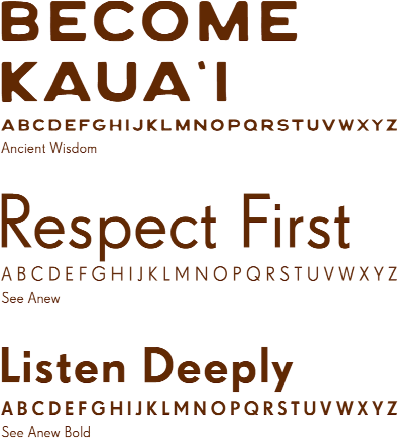
Ancient Wisdom, our primary typeface for heads and subheads, is hand-crafted yet strong, honoring the people of Hawai‘i. It pairs with See Anew, a classic 1930s sans serif for body text. Together they echo both heritage and modernity.
Color Palette
Tapa cloth-inspired earth tones were never meant to stand alone. They were intended to complement the islands’ vibrant tropical environment. A secondary color palette meant for backgrounds and framing, represent the lush, countless hues of flora and fauna of the island.
Primary
Secondary


